LEGO
World Cup Fan Zone
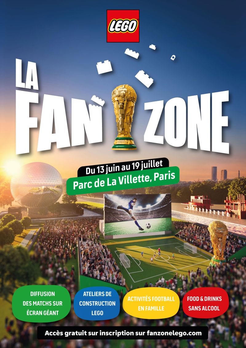
Since December 2025, LEGO has been telling its World Cup story in stages: an FIFA-licensed trophy to build yourself, then a film where Messi, Ronaldo, Mbappé and Vinícius Jr each place their minifigure on top of it. By June, the campaign needed to finally take physical shape — 1,800 m² at the foot of the Géode, in Parc de la Villette, with its own Fan Zone. One very concrete problem remained before the doors could open: giving this place a logo.
Two worlds, one signal
The brief handed to MUTT wasn't "give us a nice fan zone logo." It was more precise, and trickier: how do you fit everything the campaign had already been saying for six months into a single mark, without ever losing track of who's speaking? A logo too tied to football would have drowned LEGO in a sea of sponsor logos. A logo too "brick" would have ignored what was actually happening — a World Cup half the planet was watching in June. It had to say both things at once, without either one drowning out the other.
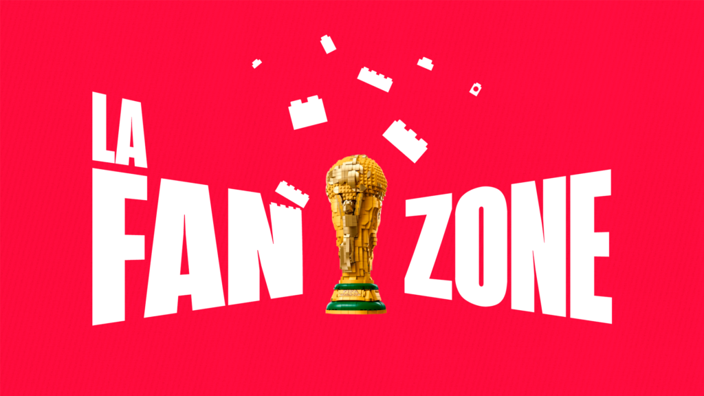
The typography answers the first half of that equation: it picks up the one used across the LEGO Editions campaign, the same as on the Messi, Ronaldo, Mbappé and Vinícius Jr sets, so the Fan Zone reads instantly as the next chapter of what audiences had already been scrolling past since April. The trophy sits at the centre — impossible to miss, because by June 2026 nobody needs it explained. Around it, a sense of motion, an energy that spins, as if all the momentum of the campaign had condensed into that one spot on the logo. And then the bricks, mid-air, signing the whole thing — the one element no other brand on the pitch could claim as its own.
A logo built to live everywhere, not just on the poster
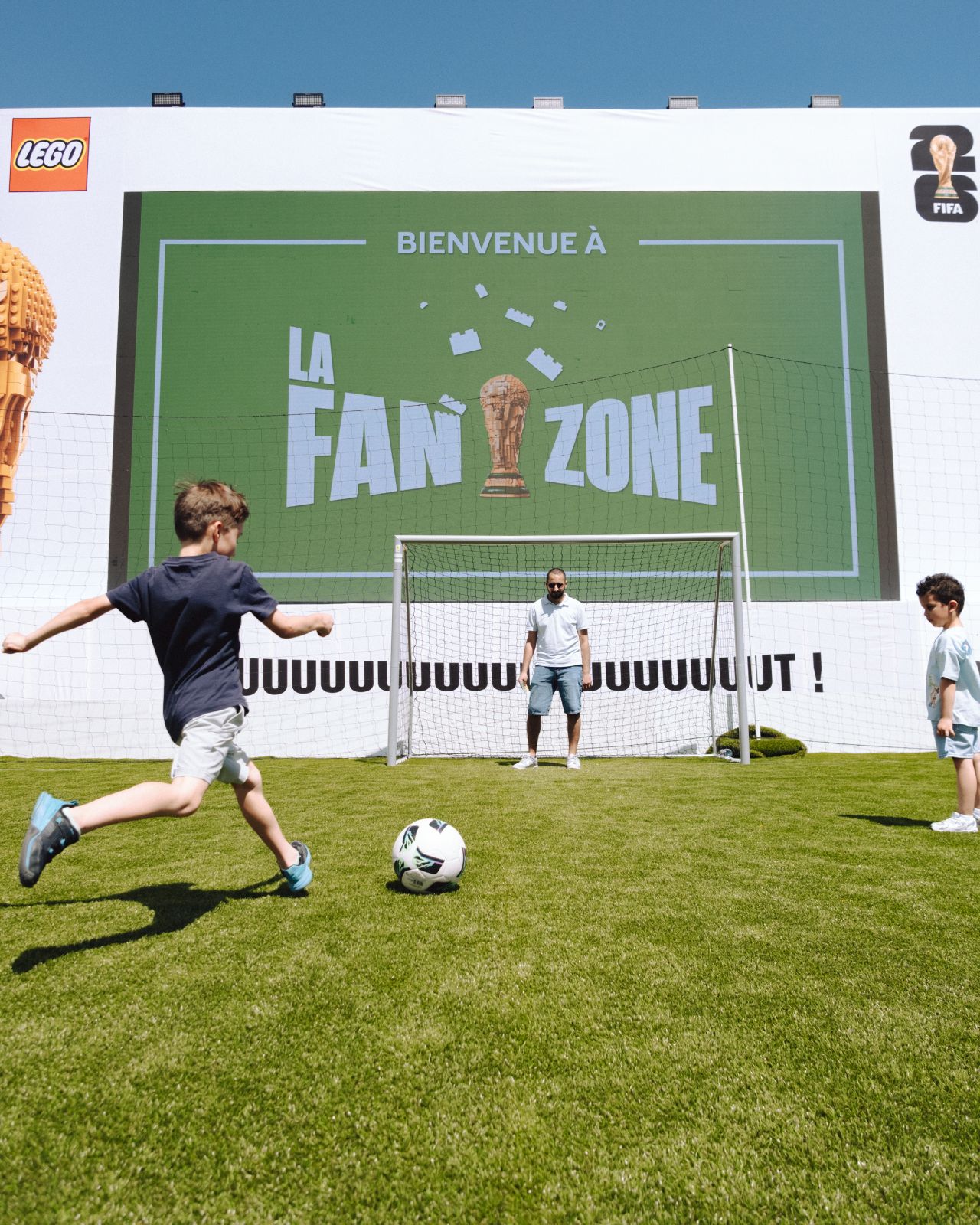
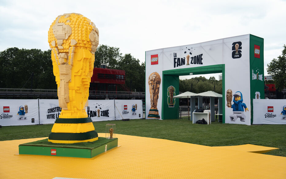
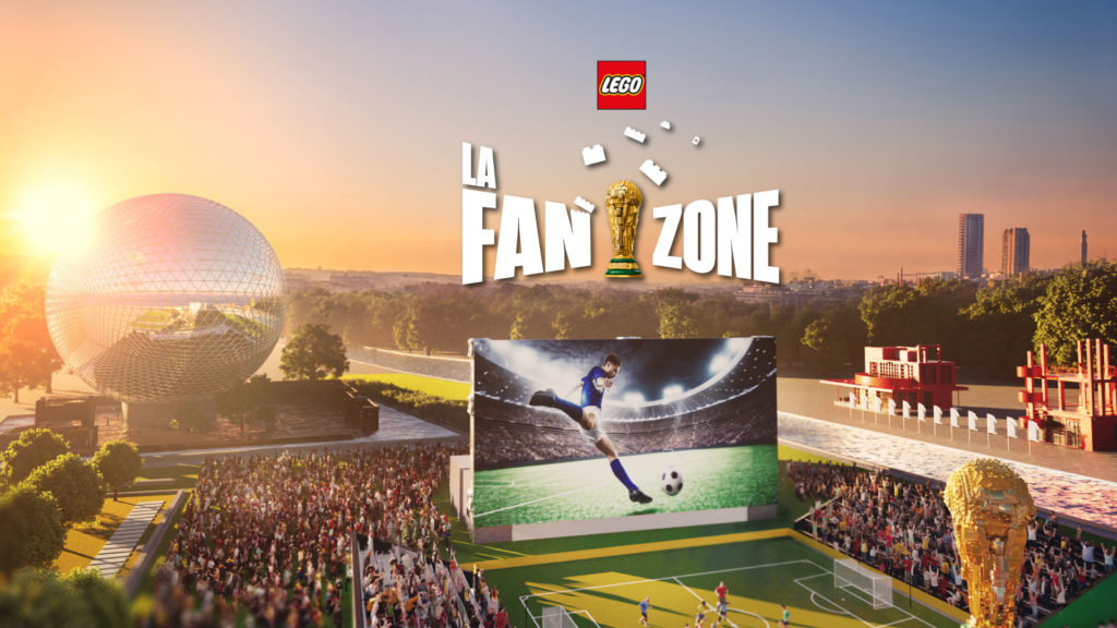
A logo for a physical activation doesn't get the luxury of only existing at billboard size. This one had to print just as cleanly on a vertical banner at the park entrance as on a plastic cup at the food stand — two surfaces that share almost nothing, not scale, not reading distance. It also had to work as a logo bump, that small signature that closes out a video or signs off a social post without needing a single word of explanation. Designing something wide enough to still read small is an exercise that leaves no room for error — every element had to earn its place.
What this logo says, once it's out in the field
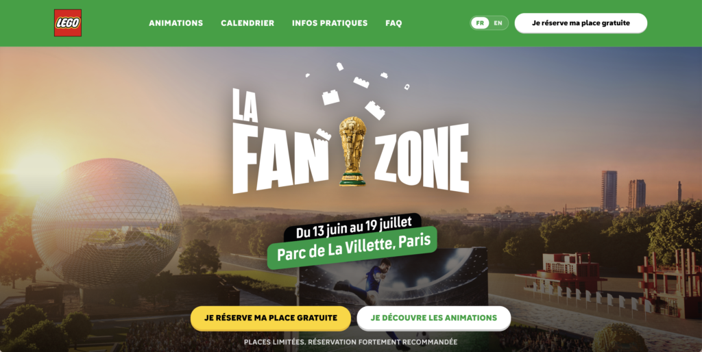
The real test for an activation logo is watching it survive contact with the ground: signage, social feeds, cups, banners, giant screens. The LEGO Fan Zone logo held up across all of them without ever needing to reinvent itself from one surface to the next — proof that a well-built mark doesn't need simplifying to travel. It just needs to be designed that way from the start.
Ready to make your brand hold together in a single mark? Let's talk.
Deliverables
Graphic identity
Logo